Logo vs. Brand Identity: What Your Business Actually Needs
A logo is one mark; a brand identity is the system that makes your business recognisable everywhere. Here is the difference, what a full identity includes, and how to decide which you need now.
By Saad Ennady, Shapedge Studio
A logo is one mark. A brand identity is the whole system that makes your business recognisable everywhere it appears — the logo plus its variations, colours, typography, imagery, tone of voice and the rules that hold them together. If you only sell in one place and rarely make new material, a well-made logo can carry you for a while. The moment you have a website, packaging, social media, a sales deck and people other than you creating content, you need the identity.
This guide explains the difference in plain terms, what a complete identity actually contains, and how to decide which one your business needs right now.
What a logo is (and what it can't do on its own)
A logo is a signature. Its job is to identify you quickly and consistently: on a shop sign, a product, an invoice, a profile picture. A good logo is simple, distinctive, readable at small sizes and works in one colour.
What a logo can't do is make decisions for you. It doesn't tell a designer which font to use on your website, which colours go on a sale banner, what your Instagram posts should look like, or how your packaging range stays coherent when you add a fifth flavour. Without those answers, every new piece is designed from scratch — and over time the brand drifts. We wrote about that cost in the branding mistake that comes from launching without a visual system.
What a brand identity includes
A complete visual identity is a toolkit. The exact contents depend on the business, but a solid one usually covers:
- Logo system — the primary logo plus secondary versions, a compact mark or icon, and clear-space and minimum-size rules.
- Colour palette — primary and supporting colours with exact values for print (CMYK/Pantone) and screen (HEX/RGB), and guidance on proportions.
- Typography — a font pairing for headings and text, with sizes and hierarchy so every page reads the same way.
- Graphic elements — patterns, shapes, icon style or a grid that make your materials recognisable even without the logo.
- Imagery direction — the style of photography, illustration or 3D you use, so visuals from different sources still feel like one brand.
- Tone of voice — how the brand speaks: a few principles and examples of words you use and avoid.
- Brand guidelines — a document that explains all of the above so your team, printers, developers and freelancers apply it correctly.
- Templates — ready-to-edit files for the things you make most: social posts, presentations, business cards, email signatures.
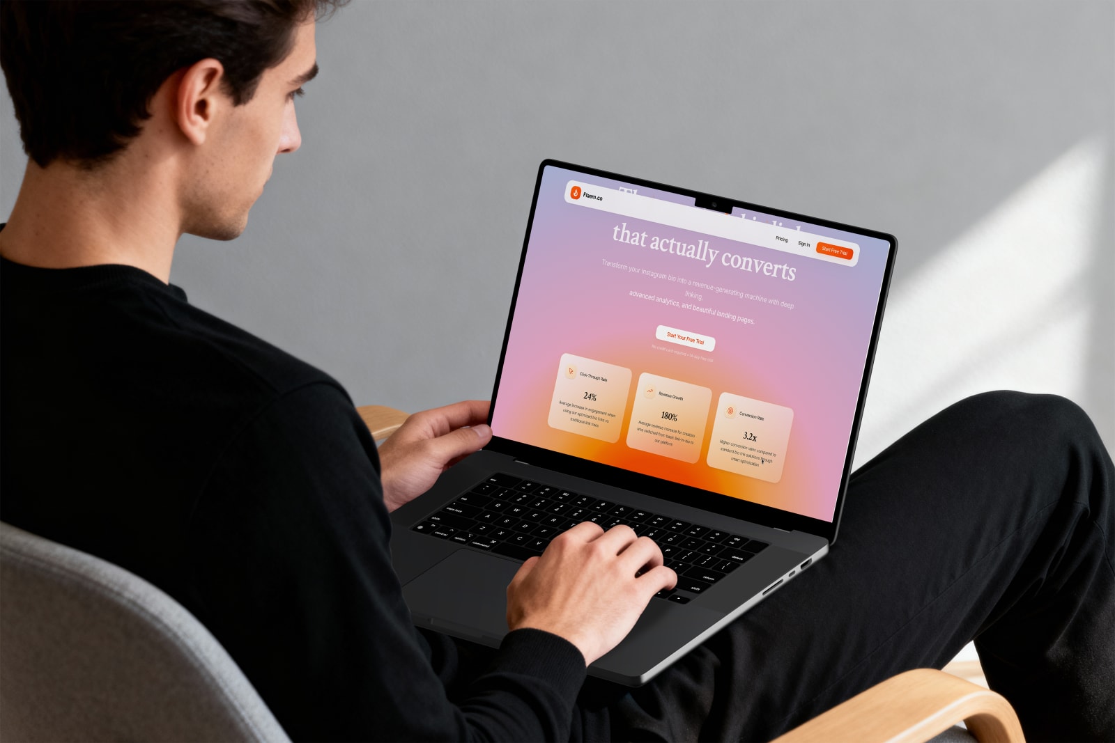
Underneath the visuals sits brand strategy: who you serve, what you promise, how you're different and what personality the brand should project. Strategy is what turns design choices from taste into reasoning. You can see how this comes together in our Flaem.co identity system, built so a fast-moving SaaS team could produce on-brand material without a designer on every task.
Logo vs. brand identity at a glance
- Scope: a logo is one asset; an identity is a system of assets and rules.
- Consistency: a logo keeps your name recognisable; an identity keeps everything recognisable.
- Who can use it: a logo still needs a designer's judgment every time; an identity lets anyone on your team produce work that looks right.
- Perceived value: a logo says you exist; a coherent identity signals that you're established and worth a premium.
- Investment: a logo costs less upfront; an identity costs more upfront and less over time, because you stop reinventing the basics.
When a logo is enough — for now
There are honest cases where starting with a logo makes sense:
- You're testing an idea and may change direction within months.
- You sell in one channel only — a market stall, a single marketplace listing — and produce very little marketing material.
- Your budget is genuinely limited and the business needs to earn before it invests.
If that's you, ask for a logo that's designed to grow: simple enough to sit inside a future system, delivered with at least a basic colour and font choice. That way the later identity work builds on it instead of replacing it.
When you need a full brand identity
You've outgrown a logo-only setup when any of these are true:
- You're launching or redesigning a website or a packaging range.
- You want to charge premium prices and your visuals don't yet look the part.
- More than one person creates content, and it shows.
- You're raising money, entering a new market or pitching larger clients.
- Your social media, website and printed material look like three different companies.
How to brief a designer so you get the right one
Whatever you decide, a clear brief saves time and money. Include:
- What the business does and who the customer is, in two or three sentences.
- Where the brand will appear in the next 12 months: website, packaging, social, signage, events.
- Three brands you admire (in any industry) and what you like about each.
- What you want people to feel when they first see you — for example premium, friendly, technical, bold.
- Your timeline and budget range, so the studio can recommend the right scope rather than guess.
Frequently asked questions
Is a brand identity the same as a brand?
No. Your brand is what people think and feel about your business — it's built by every experience they have with you. Your brand identity is the set of visual and verbal tools you control to shape that perception.
Can I add a brand identity to my existing logo?
Often, yes. If your logo is well made, an identity can be built around it: colours, type, graphics and guidelines that extend what you already have. If the logo has real problems — poor legibility, no small-size version, a dated style — it's usually better to refine it at the same time.
What files should I receive at the end?
At minimum: your logo in vector (SVG, EPS or PDF) and image formats (PNG), in colour, black and white; colour values for print and screen; your fonts or links to licence them; brand guidelines as a PDF; and editable templates for your most-used materials. You should also own the final artwork once the project is paid.
Not sure which one you need? Tell us about your business and we'll recommend the right starting scope — or see what's included in our brand strategy & identity service.
Need help applying this to your brand? Talk to Shapedge →


